Your nonprofit’s website is more than just an online presence; it’s a vital tool for storytelling and engagement. But making it stand out requires knowing exactly what to include. Let’s dive into the essential elements that can turn your website from good to unforgettable.
A standout nonprofit website is more than just a hub for information; it’s a launchpad for engagement and a beacon for community building. With countless causes vying for attention, your site needs to do more than just exist—it needs to communicate, captivate, and compel. Moving forward, we’ll explore the essential elements that not only pull visitors in but also motivate them to take action, transforming passive interest into active support for your mission.
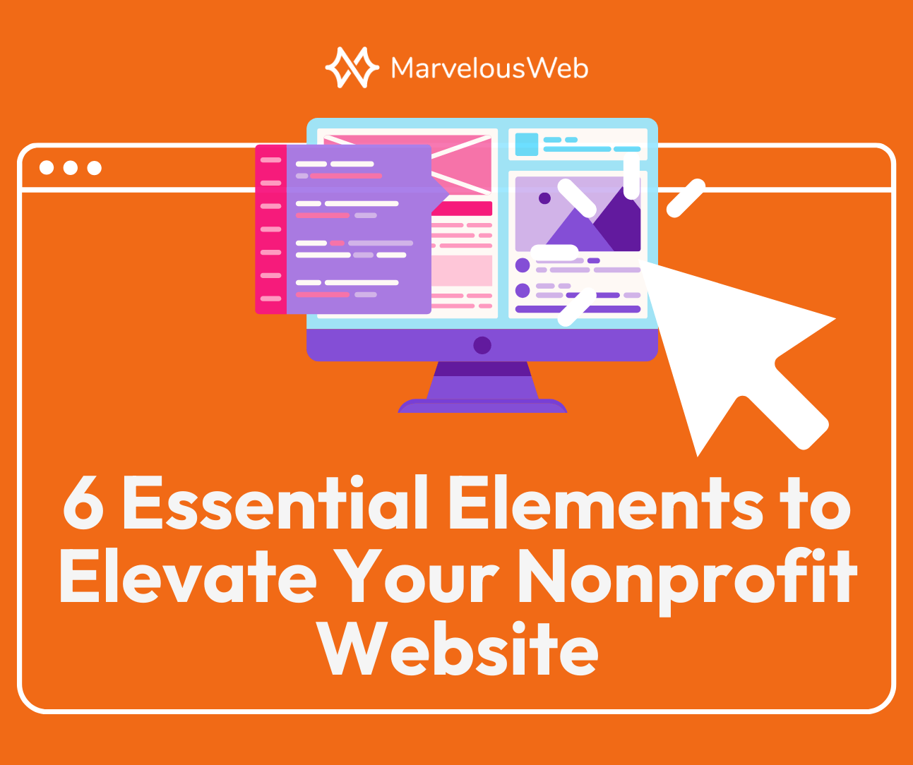
An overview of the 6 elements
Our exploration will navigate through six fundamental elements that are pivotal for any nonprofit website aiming for impact and engagement:
- Impress…Above-the-Fold: Instantly communicate your mission and catch your visitor’s attention.
- Create Space for Who You Serve: Ensure your website reflects and resonates with your community.
- Display Available Programs Clearly: Highlight your initiatives to showcase your active role and impact.
- Easy and Intuitive Donation Process: Remove barriers to giving, making it seamless for supporters to contribute.
- Showcasing Upcoming Events: Keep your community engaged and informed about how they can participate.
- Make It Clear How People Can Help: Offer clear paths for involvement beyond financial contributions.
Now, let’s dive deeper into each element, exploring how they work together to create a website that’s not just seen but felt, encouraging visitors to engage, contribute, and become part of your community’s story. Each component plays a crucial role in transforming your site into an engaging, action-inspiring platform. Follow along as we break down these elements further, providing you with the insights needed to elevate your online presence effectively.
The 6 Must-Have Features for Your Nonprofit’s Website
1. Impress…Above-the-Fold
Visiting a website without clear messaging is like opening a book to a random page—you’re intrigued but have no context. The content above-the-fold should serves as the book cover, offering a snapshot that invites readers into your story.
“Above-the-fold” is the part of the website visible without scrolling, crucial for making a strong first impression. It includes the hero section but also extends to your menu header, call-to-actions, logo, and all other elements that may appear at the top of you home page. This area should clearly articulate your nonprofit’s mission and how visitors can engage. It’s about using concise language and compelling visuals to instantly convey who you are, what you stand for, and how visitors can help. This not only captures attention but also encourages further exploration, setting the stage for a deeper connection with your cause.
What Happens If You Don’t Have Clarity Above-the-Fold
Navigating a website should never feel like deciphering a puzzle. Clear messaging right at the outset not only guides your visitors but also aligns them with your mission from the first click. The absence of this clarity can create a disconnect, affecting everything from engagement to donations. Let’s examine the specific drawbacks of overlooking this critical element, highlighting the importance of getting it right.
What happens if you do?
- Ensures visitors immediately understand your mission
- Encourages further exploration of your site
- Increases the likelihood of engagement and support
What happens if you don’t?
- Confusion overshadows visitor engagement
- Initial interest quickly fades without clear direction
- Potential supporters leave, reducing donation opportunities
- The essence of your cause becomes muddled
- High bounce rates reflect missed connections
How To Implement Clear Messaging
Turning the tide from confusion to clarity on your website is more straightforward than you might think. By focusing on a few key improvements, you can significantly enhance your site’s above-the-fold content. Here are practical steps to ensure your message hits home immediately.
- Craft a concise, impactful mission statement inside your hero section
- Highlight a clear call to action under your statement
- Select imagery or a video that complements your message
- Regularly review and adjust for clarity
2. Create a Space for Who You Serve
Create Space for Who You Serve: Understanding Your Audience
Just as every story needs an audience, your nonprofit website must resonate with the people you aim to serve. This connection begins with creating a space on your website that acknowledges their needs, challenges, and aspirations.
What happens if you do?
- Fosters a sense of belonging by showing your audience they are recognized and valued
- Boosts engagement when people see their experiences mirrored
- Encourages donations by demonstrating the impact of contributions on real lives
- Directs individuals to helpful resources, ensuring they can easily access the support and information they need
- Strengthens community by reinforcing your commitment to serving and understanding your audience’s needs
What happens if you don’t?
- Visitors may feel overlooked, reducing engagement
- Engagement and interaction rates may drop
- Supporters struggle to see the direct impact of their contributions
- A generic approach may fail to communicate your organization’s unique mission
- Community members might not find the resources or support they seek
Implementing Audience-Specific Spaces on Your Website
Crafting a website that speaks directly to your audience is both an art and a science. By integrating specific elements and strategies, you can ensure your digital space welcomes and engages those you’re committed to helping. Here’s how to get started:
- Create pages for each audience which include tailored resources and information
- Include short descriptions (info boxes) and links on your home page and menu that lead to these spaces
- Ensure your website content throughout highlights your audience where relevant and links to their respective pages
3. Display Available Programs Clearly
You have important programs to offer and too often, organizations may not include all or up-to-date programs on their website. You may know your programs internally but it is so important to share that with those who may visit your website. Your programs show your mission in-action. But if visitors can’t easily find or understand these initiatives on your website, you’re missing a critical opportunity to showcase the impact and breadth of your work.
What happens if you do?
- Directly informs visitors about the scope of your work and its impact
- Facilitates deeper engagement and understanding through clear program descriptions
- Sparks interest in targeted support or participation by highlighting specific initiatives
- Demonstrates your nonprofit’s active role in making a difference with well-presented programs
- Builds trust with supporters and beneficiaries by being transparent about your activities
What happens if you don’t?
- Visitors may miss understanding the full extent of your impact
- Potential volunteers and donors deterred by lack of clarity on how to contribute
- Missed opportunities for targeted engagement and support
- Questioned credibility if information on activities isn’t easily accessible
- Beneficiaries unaware of the resources available to them
How to Showcase Your Programs Effectively
Implementing a strategy to clearly display your programs can greatly enhance your website’s utility and appeal.
- Organize programs into easily navigable sections
- Use engaging descriptions and visuals for each program
- Include clear calls to action, guiding visitors on involvement
- Offer testimonials or success stories illustrating program impact
- Keep program pages updated with the latest information and outcomes
Ensuring your programs are displayed clearly and compellingly invites visitors to delve deeper into your mission, encouraging engagement, support, and participation. This approach not only serves your current audience but also attracts new supporters, amplifying your nonprofit’s reach and impact.
4. Easy and Intutive Donation Process
Too often overlooked, your donation interface and process is essential to your mission. Therefore, creating a simple and intuitive interface is not optional. The ease with which someone can support your cause is pivotal. A complicated or unclear donation process can quickly deter even the most enthusiastic potential donors. Here’s why streamlining this process is crucial for your nonprofit’s growth and how to ensure your website facilitates every step of the way.
What happens if you do?
- Ensures quick and hassle-free support from visitors, maximizing donation opportunities
- Simplifies the donor’s journey, encouraging more frequent and larger contributions
- Reduces the risk of abandonment mid-donation due to frustration or confusion
- Enhances the overall user experience, aligning with expectations for modern website interactions
- Reflects the professionalism and efficiency of your organization, building trust with potential donors
What happens if you don’t?
- Potential donors leave before completing their contributions, feeling discouraged by complexity
- Lost donation opportunities directly impact the resources available for your programs and services
- A negative donation experience can deter future engagement and support from the community
- Failing to offer multiple donation options limits accessibility and convenience for diverse donors
- Lack of clear guidance or reassurance during the donation process can raise concerns over security and use of funds
Steps to Optimize Your Donation Process
Creating an easy and intuitive donation process on your website not only supports your immediate fundraising goals but also fosters a lasting relationship with your donors. Here’s how you can optimize your process:
- Streamline the donation form to include only essential information
- Offer multiple payment methods to accommodate donor preferences
- Ensure the donation button is prominently displayed on every page
- Provide clear instructions and support for any questions or issues
- Utilize third-party donation software that will simpliy the process
By removing barriers to donate, you open the door to greater support and engagement, fueling your mission for the long term.
5. Showcasing Upcoming Events
People love events! They’re a great way to bring people out who otherwise may not know about your cause or bring the people together who do. Showcasing and encourgaging attendance to your nonprpfti’s events goes a long way by keeping existing members happy and engaged through direct partipication and often fun. However, if your website doesn’t effectively highlight these events, you could be missing out on significant engagement and support opportunities. Let’s explore the importance of showcasing events and how to do it right.
What happens if you do?
- Increases awareness and participation by making event details easily accessible
- Encourages community engagement, strengthening bonds with supporters
- Boosts fundraising efforts by highlighting opportunities to contribute
- Showcases the dynamic and active nature of your organization
- Provides a platform to celebrate successes and share future goals with your audience
What happens if you don’t?
- Lower event attendance due to lack of visibility
- Missed chances for fundraising and community building around events
- Reduced engagement from supporters who might not be aware of how active your organization is
- A gap in communicating the full scope of your organization’s work and its impact on the community
- Potential supporters remain unaware of ways to get involved or contribute
How to Effectively Feature Your Events
Effectively showcasing your events on your website not only promotes greater participation and support but also highlights the vibrancy and impact of your nonprofit. Let’s talk about how you can do this with your website:
- Create a dedicated events section on your website with easy navigation
- Use engaging visuals and compelling descriptions for each event (you can use images from the past events too!)
- Include all necessary details: date, time, location (or link for virtual events), and how to participate or register (with links!)
- Promote upcoming events prominently on your homepage and through regular updates
- Make use of social media to promote the event page on your website
By making event information accessible and engaging, you invite your community to join you in making a difference, one event at a time.
6. Make It Clear How People Can Help
Empowering Action Through Clarity
While donations are crucial, understanding the multifaceted ways individuals can support your cause is key to fostering a robust community around your nonprofit. As you increase traffic to your website, more visitors to your website, and have more attention to your nonprofit overall, people will want to know what they can do to help. This sixth step is to ensure your website makes it very clear what someone can do to help. We’ll dive into why you should do this further and how you can do it.
What happens if you do?
- Clarifies the various ways to support, encouraging broader engagement
- Empowers visitors by providing multiple avenues for involvement
- Increases the likelihood of assistance that matches individual capabilities and interests
What happens if you don’t?
- Potential supporters may feel unsure how to contribute, leading to inaction
- Missed opportunities for volunteerism, partnerships, and non-monetary donations
- A lack of diverse engagement can limit your nonprofit’s reach and impact
- Supporters who prefer non-financial contributions might feel excluded
Guiding Supporters with Clear Information
From volunteering and in-kind donations to advocacy and community partnerships, highlighting these pathways allows your nonprofit to tap into the full spectrum of community support, driving your mission forward with the collective power of your engaged and diverse supporter base. Let’s dive into the “how”.
- Clearly list all the ways individuals can support your mission, from volunteering to advocacy
- Include a step-by-step for these different avenues of involvement
- Provide detailed descriptions and instructions for each type of support
- Feature stories or testimonials that highlight the impact of various forms of assistance and what the volunteer experience is like
- Ensure navigation to support options is intuitive and accessible from anywhere on your site
YOUR Next Steps (Taking Action)
There you have it! Those are the 6 elements we think would be important for your organization.
It’s pretty easy to read and enjoy an article like this, understanding the importance of the steps outline, but it’s much harder to do something effective with the information. So I like to take a moment to ask you to take a moment to decide what can be done. I understand. Running a nonprofit is in no way easy. We only have so much time in a day and everything cannot be done at once. But….we can organize and we can schedule. So take a minute or two to ask yourself these questions:
- Which of these elements could best help our organization?
- Who can implement the steps for that element on our existing website?
- When can they do this?
- What do I need to do to put this on their schedule?
By asking yourself these questions, you are more likely to think on these things in a tangible and more like to make them happen so you can eventually see the impact they can have on your business.
Now it’s your turn!
Conclusion
It’s clear that a strategic approach to web design goes a long way in amplifying your mission. From ensuring your message is unmistakably clear to making it effortless for supporters to contribute, every detail matters in creating a site that not only attracts but deeply engages!
So we hope this article has been helpful in shedding light on the critical components of a successful nonprofit website. If you have questions or need expert assistance in implementing these ideas, MarvelousWeb is absolutely here for you. MarvelousWeb specializes in crafting websites that resonate with the heart of nonprofit missions, ensuring your website is not only visually appealing but deeply functional and aligned with your goals. Whether you’re looking to start from scratch or refine your existing site, our team is ready to help you make a lasting impact.
Feel free to give us a call or use the form on our contact page to let us know how we can help you!